A strong Finnish for new traditional.
Finn Crisp
Finland through and through
Sourdough rye crispbread has been a staple of the Finnish diet for generations. But as the popularity of different cuisines rose, new innovations appeared on shelves and artisan challenger brands appeared on shelf, younger audiences were turning away from tradition.
It takes courage to re-invent an original, but with this new context, Finn Crisp challenged us to update their brand positioning and pack design to extend the brand’s appeal across diverse consumer profiles, occasions and international markets. The new design would create range differentiation and provide a platform for future innovation.
It takes courage to re-invent an original, but with this new context, Finn Crisp challenged us to update their brand positioning and pack design to extend the brand’s appeal across diverse consumer profiles, occasions and international markets. The new design would create range differentiation and provide a platform for future innovation.
Brand redesign
Packaging
Brand guidelines
Art Direction
Innovation
Brand strategy

Finn Crisp is a brand on a journey and BrandMe has helped us to modernise our portfolio and created a whole new range to target a more urban and younger consumer. We are super happy with their creativity, highly strategic skills and their high-quality delivery.
Stephanie Johansson
Brand & Portfolio Manager, Finn Crisp, Lantmännen

Approach.
Tradition for a new audience.
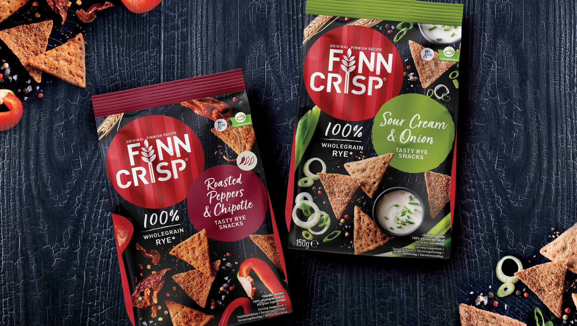
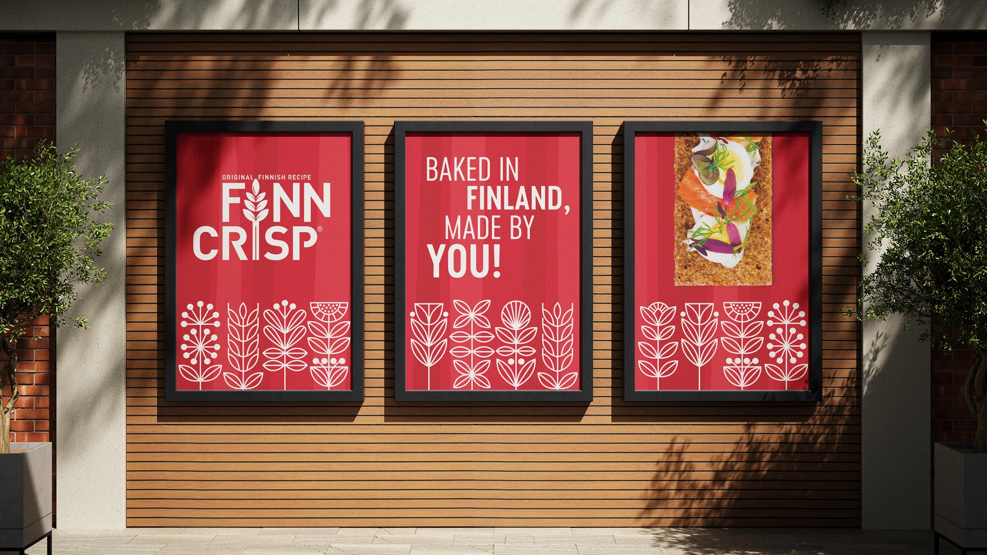
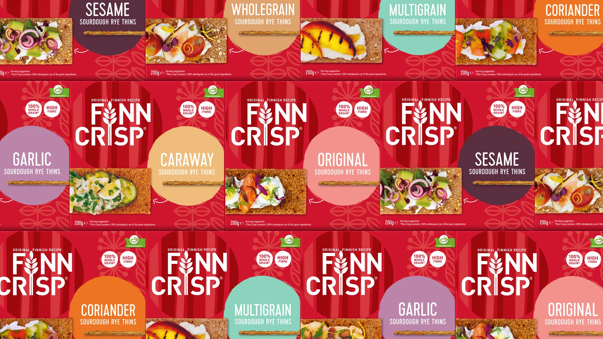
Our challenge was to reinvent Finn Crisp in a way that appealed to the young urban audience, highlighting the versatile and tasty ways crispbread can be used in a snack. Maintaining the strong Finnish heritage to reassure existing consumers, we also tap into the younger generation’s desire for genuine provenance.
Embracing Finland’s unique culture and landscape alongside Finn Crisp’s long baking tradition, we created an identity that captures the silver birch and baking craft. Retaining the quintessential red, the new brand architecture helps to distinguish each range under the Finn Crisp umbrella and enticing food photography, shot by a Finnish photographer, further adds to its foodie appeal.
Embracing Finland’s unique culture and landscape alongside Finn Crisp’s long baking tradition, we created an identity that captures the silver birch and baking craft. Retaining the quintessential red, the new brand architecture helps to distinguish each range under the Finn Crisp umbrella and enticing food photography, shot by a Finnish photographer, further adds to its foodie appeal.